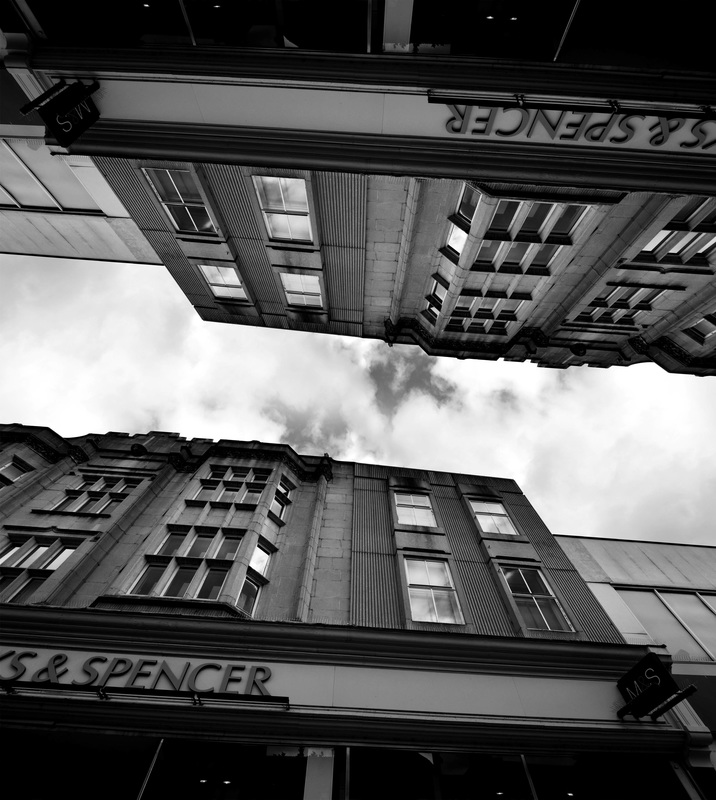
above image by Brad Sloan
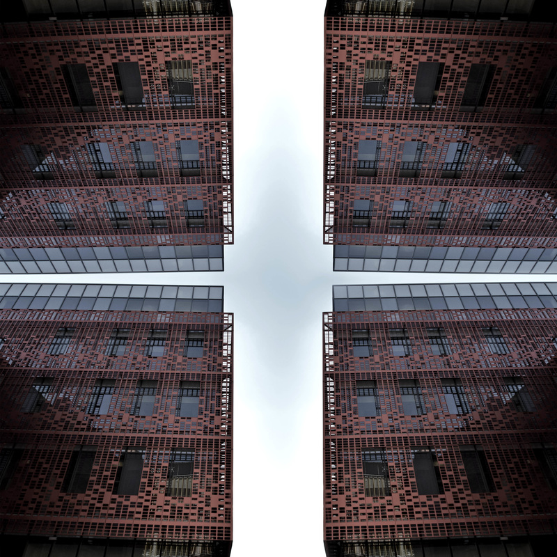
Artist - Brad Sloan - examples of work


Image analysis...


I have chosen to use Brad Sloan's work because I find the reflection/symmetry very interesting and it fits with my project because there is no busyness in his images that comes from people (I planned for my project to start with no people and end with an overwhelming amount of people). The images themselves are quite busy because there is so much repetition and detail in the buildings but I believe the white in the sky gives an element of calm to the overall image. Sloan's work, in my opinion, is experimental photography and the subject of his images is buildings, the subject is abstracted because he reflects them to make the overall image symmetrical, however he does in a way that looks almost realistic. I don't think there is any hidden meaning or a story behind his work but it is still very interesting to the viewer.
The two images have a unique composition which isn't widely used in other street photography, making it interesting to the viewer. The symmetrical composition enhances the subject (the buildings) and the way the images are structured is aesthetically pleasing because they are dark around the edges and become very light in the centre (vignette), which would also attract a viewers eye is it were displayed on a wall for example. A high contrast is created by the images being in black and white and by Sloan using a strong vignette making the out edges of the images very dark in comparison to the whiteness of the sky in the centre of the work. Texture is created in the work though the juxtaposition of the roughness of the building and the calmness/smoothness of the sky, additionally, the balconies on the right image gives a 3D feel to the image as the light reflecting off them shows they are protruding from the building.
Sloan may have had to research locations to do the photoshoots, however the fact they are outdoors means it was unlikely he needed to get permission to actually take the photos. The quality of the images suggests a digital camera was used, even though they are black and white. The black and white may have been added during the post processing via photoshop, this would also have been used to reflect the buildings and create symmetry. Furthermore, I believe Sloan would have created the vignette and added contrast on photoshop too.
There isn't a specific mood created by the images however the darkness of them may give a dark and eerie atmosphere and depending on the setting of the photos, they could be used to suggest a number of different situations e.g. a crime scene or a rough neighbourhood, I find this plasticity very interesting.
Contact sheets...


Own edits...

Edit 1

Edit 2

Edit 3

Edit 4
Edit 5
Edit 6
I used colour in this edit because when I made it black and white, the orange frame blended in too much and it looked very grey, so instead I lowered the saturation to a point where the orange frame doesn't stand out too much.
Hanging Plan...

I placed the images in a way that the diagonal of the photos points downwards, towards the centre. The two images in the centre are both symmetrical four ways, giving them a central composition so I believe they look best in the middle and the coloured one is on top because it looks better that way. Additionally, the sky on the four outer images all lines up as the images meet.
Development - Ryo Ohada
To develop my work I have edited my images in the style of Ryo Ohada who crops his images, flips them and displays them as if the are being seen through a kaleidoscope or by an insect. He uses this technique on various subjects, ranging from nature scenes to urban buildings and housing.


Own Interpretation...


For development I took an edit, cropped it and flipped it to create the images on the left, the images in the middle are cropped (and flipped) from the left images and the images on the right are cropped from the middle images. I did this to portray the idea of there being buildings everywhere you look (idea given off by Sloan's work) and I developed it to give the buildings a more overpowering feel. I kept the development black and white so it is clear that it leads on from the Brad Sloan photoshoot.
